There are four threshold conditions monitored and displayed in these graphs.
The graphs are accessed by right clicking on the connecting line between two devices.
Transmitted Bandwith (Xmit) - the percent of available bandwidth used for transmitting.
Received Bandwidth (Recv) - the percent of available bandwidth used for receiving.
Ping Response - the response time to a ping request from the IntraVUE host to the device.
Ping Failure - the percentage of failed pings in a one-minute period.
The graph is 'live' and updated with new data every one minute.Bandwidth data is collected once per minute from every device having SNMP and additionally from every switch port that has a 'child' device under it.
If a devices does not support SNMP but is connected directly to a managed switch, the bandwidth data is collected from the parent switch.
Ping data is collected many times per minute, typically 5 to 10 times. This successful pings in a one minute period have their response times averaged
and that one minute average is used as one data point for Thresholding. If a ping is unsuccessful and the next ping is successful, it is counted as one ping failure.
Over the course of the one minute period the number of failures divided by the number of pings in the one minute period becomes the Ping Failure rate for that one minute period.
(If two successive pings fail, it is recorded as a device disconnect.)
Enable or Disable Alarms
There are two checkboxes to enable or disable alarms for Bandwidth or Ping thresholds. These can only be changed by the Admin.
Both Ping and Bandwidth alarming is enabled in the above example.
Either transmitted or received data bandwidth can trigger a Bandwidth alarm.
Either exceeding the ping failure percent in the last minute or exceeding the ping response threshold in the last minute will generate an alarm.
Ping Data
Ping data is gathered 5 to 7 times a minute and the average of that minute is used as a single data point.
Any ping failures are recorded and the number of ping failures in that one minute is the Ping Failure Percent.
Bandwidth Data
If a device does not support SNMP, IntraVUE will try to get bandwidth information from the next higher switch of the device.
The device that provides the SNMP information is identified by (Datasource) on the Connection From/To lines.
Transmitted data is the data from the parent or 'from' device regardless of the data source.
Data Resolution
The data is stored internally in a way that progressively creates historical data from more recent data.
Over time data kept in seconds format is averaged to become minute format, minute data becomes 10 minute data, hour data becomes day data, and so on.
Below the Update button is the Time Scale drop down list. Selecting this control will display the following time intervals that may be selected:
3 hours
6 hours
30 hours
60 hours
15 days
30 days
6 months
12 months
3 and 6 hour data has one minute resolution. 30 and 60 hour data has 10 minute resolution. 15 and 30 day data has 2 hour resolution. 6 and 12 month data has 1 day resolution.
Average or Peak Values
As data becomes older it is averaged into larger time period samples. At the time of averaging the peak value during the period is also stored. When viewing the data you can use a Drop Down Listbox to choose the average for a period or the peak for a period. Only when viewing data for the 3 hour period are both values the same.
Graph Vertical Scale
At the top of each graph is the graph full scale value. This value will change as the data being presented is updated.
It is designed so that the greatest actual values are near the graph top.
As you cycle between the threshold dialogs of several devices the graph max values will change to provide you the best data for interpretation
Bandwidth Graphs
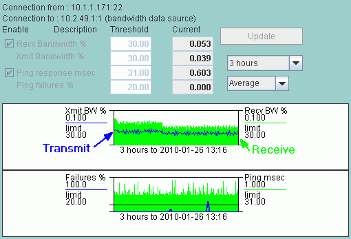
The Transmit (Xmit) Bandwidth data is displayed in the graph as a blue line graph. The Receive (Recv) Bandwidth data is displayed as a green bar graph.
In the example above the bandwidth graph's scale is 1.000 percent bandwidth and the bandwidth thresholds are both set at 30.00 percent.
If there had been a spike to 22 percent in the Xmit bandwidth in the 3 hour period shown, the scale would have been set to about 25.0 percent so you could see all the data without exceeding the graph max.
Ping Graphs
For Ping statistics the Ping Failure percent and the ping response times are both shown in the same graph.
The graph max for Ping Failures is always 100%, shown on the left.
The graph max of the Ping Response data varies similar to Bandwidth in that the scale changes so the maximum amount of significant data is visible.
In the example above the Ping Response max is 1 millisecond showing frequent spikes and the Ping Response Threshold is 31 milliseconds. There were also 2 ping failures as shown by the blue lines in the graph.
Setting Threshold Values for this device
The Update button is selected by the Administrator after any change to the threshold settings and will update the database for the new settings.
Be careful the graph does not update just as you select update.
See Also: Multiple Device Threshold Graphs
 Enable or Disable Alarms
There are two checkboxes to enable or disable alarms for Bandwidth or Ping thresholds. These can only be changed by the Admin.
Both Ping and Bandwidth alarming is enabled in the above example.
Either transmitted or received data bandwidth can trigger a Bandwidth alarm.
Either exceeding the ping failure percent in the last minute or exceeding the ping response threshold in the last minute will generate an alarm.
Ping Data
Ping data is gathered 5 to 7 times a minute and the average of that minute is used as a single data point.
Any ping failures are recorded and the number of ping failures in that one minute is the Ping Failure Percent.
Bandwidth Data
If a device does not support SNMP, IntraVUE will try to get bandwidth information from the next higher switch of the device.
The device that provides the SNMP information is identified by (Datasource) on the Connection From/To lines.
Transmitted data is the data from the parent or 'from' device regardless of the data source.
Data Resolution
The data is stored internally in a way that progressively creates historical data from more recent data.
Over time data kept in seconds format is averaged to become minute format, minute data becomes 10 minute data, hour data becomes day data, and so on.
Below the Update button is the Time Scale drop down list. Selecting this control will display the following time intervals that may be selected:
Enable or Disable Alarms
There are two checkboxes to enable or disable alarms for Bandwidth or Ping thresholds. These can only be changed by the Admin.
Both Ping and Bandwidth alarming is enabled in the above example.
Either transmitted or received data bandwidth can trigger a Bandwidth alarm.
Either exceeding the ping failure percent in the last minute or exceeding the ping response threshold in the last minute will generate an alarm.
Ping Data
Ping data is gathered 5 to 7 times a minute and the average of that minute is used as a single data point.
Any ping failures are recorded and the number of ping failures in that one minute is the Ping Failure Percent.
Bandwidth Data
If a device does not support SNMP, IntraVUE will try to get bandwidth information from the next higher switch of the device.
The device that provides the SNMP information is identified by (Datasource) on the Connection From/To lines.
Transmitted data is the data from the parent or 'from' device regardless of the data source.
Data Resolution
The data is stored internally in a way that progressively creates historical data from more recent data.
Over time data kept in seconds format is averaged to become minute format, minute data becomes 10 minute data, hour data becomes day data, and so on.
Below the Update button is the Time Scale drop down list. Selecting this control will display the following time intervals that may be selected: